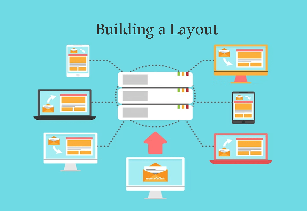
Designing a layout that is easy to navigate and draws attention to the most important parts of your email content is crucial for ensuring that your subscribers engage with your email. Here are some tips for building an effective layout:
- Use a clear hierarchy: The most important information in your email should be at the top, followed by secondary information and additional details. Use clear headings and subheadings to organize your content.
- Use white space: White space helps to separate elements of your email and make it easier to read. Don’t be afraid to leave some blank areas to give your content room to breathe.
- Keep it simple: Avoid cluttering your email with too many elements. Stick to a simple layout with a clear call-to-action.
- Use columns: Dividing your content into columns can make it easier to read and draw attention to specific sections.
- Use visuals: Including visuals such as images and videos can break up the text and make your email more visually appealing.
- Use responsive design: Make sure your email template is optimized for all screen sizes, from desktop to mobile, to ensure your layout looks good on any device.
By following these tips, you can create a layout that is easy to navigate and draws attention to the most important parts of your email content.


