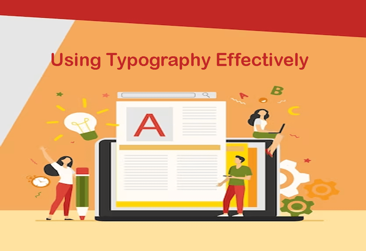
Typography is an essential part of email design, and it can make a significant impact on the overall readability and effectiveness of your email campaigns. Here are some tips for using typography effectively in your email templates:
- Use easy-to-read fonts: It’s essential to choose fonts that are easy to read, even at small sizes. Sans-serif fonts like Arial, Helvetica, and Verdana are generally a safe choice, while serif fonts like Times New Roman can work well for longer text blocks.
- Create hierarchy with font size and weight: Use larger font sizes and bolder weights for headlines and subheadings, and smaller sizes for body text. This creates a visual hierarchy that guides the reader’s eye through the email content.
- Limit your font choices: To maintain consistency and clarity in your email design, it’s best to limit your font choices to two or three complementary fonts. This includes one for headlines, one for subheadings, and one for body text.
- Use contrast to highlight important information: Using contrasting fonts can help draw attention to key pieces of information, such as a call-to-action or a discount offer.
- Pay attention to spacing and alignment: Proper spacing and alignment are essential for readability and can help create a clean and organized look for your email design.
By using typography effectively, you can enhance the overall look and feel of your emails, improve readability, and reinforce your brand voice.
